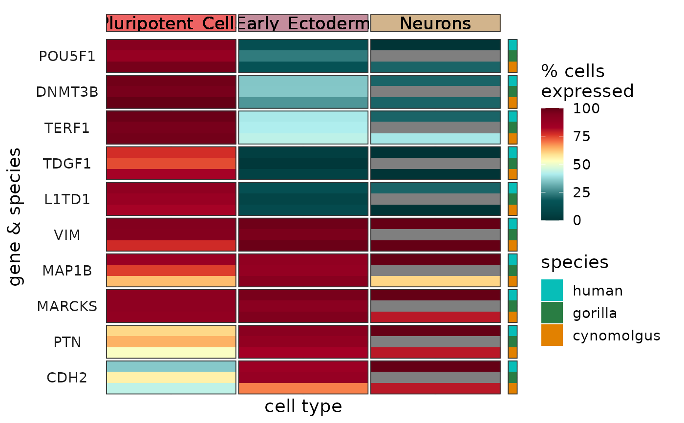
Plots the summarized expression of one or more genes per cell type and species as a heatmap.
Usage
plotSumExprHeatmap(
  genes,
  sce,
  summary_metric = "pct",
  cell_type_column = "cell_type",
  heatmap_colors = NULL,
  species_colors = NULL,
  cell_type_colors = NULL,
  clip = 3,
  font_size = 14,
  label_size = font_size/3
)
Arguments
- genes
Character vector, the names of the genes for which the expression profiles should be plotted.
- sce
SingleCellExperimentobject containing the expression data (logcounts and metadata) for all network genes. Required metadata column:- species
Character, the name of the species.
- {{cell_type_column}}
Character, cell type annotation.
- summary_metric
Character, the metric for summarizing the expression of a gene per cell type and species. One of "pct" (the percent of cells expressing the gene, the default) and "mean" (mean expression in logcounts).
- cell_type_column
Character, the name of the cell type annotation column in the metadata of
sce(default: "cell_type").- heatmap_colors
Character vector, the heatmap colors for the summarized expression levels. The vector can contain any number of colors that will be passed on to and converted into a continuous scale by
scale_color_gradientn.- species_colors
Character vector, colors per species.
- cell_type_colors
Character vector, colors per cell type.
- clip
Numeric specifying the degree of clipping. For each gene, the expression level values that are more standard deviations away from the mean than
clipare treated as NA. The default is 3 meaning that expression levels are clipped to the range of mean \(\pm\) 3\(\sigma\) per gene.- font_size
Numeric, font size (default: 14).
- label_size
Numeric, font size of the cell type labels (default:
font_size/ 5).
Value
A heatmap as a ggplot object showing the summarized expression levels of the input genes per cell type and species.
Details
The function creates a heatmap, with columns corresponding to cell types, rows corresponding to genes and species, and colors corresponding to either percent of cells expressing the given gene (if summary_metric = "pct", the default) or mean expression in logcounts (if summary_metric = "mean").
The cell types and species are visualized as annotation graphics above the heatmap using cell_type_colors and on the right hand side of the heatmap using species_colors, respectively.
Expression levels are clipped to the range of mean \(\pm\) 3\(\sigma\) per gene, this can be changed via the parameter clip. Clipping aids visualization by preventing the outlier data points from squishing the rest of the data into a small color range. If clipping is not desired, please set clip to Inf.
See also
Other functions to plot gene expression profiles:
plotExprAlongPseudotime(),
plotExprHeatmap(),
plotExprViolin(),
plotSumExprLine()
Examples
plotSumExprHeatmap(c("POU5F1","DNMT3B","TERF1","TDGF1","L1TD1","VIM","MAP1B","MARCKS","PTN","CDH2"),
                             sce)